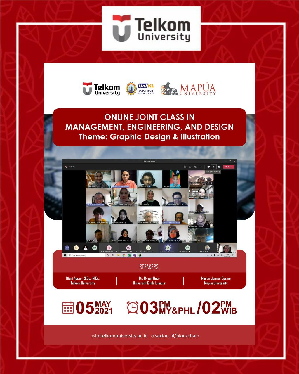
Graphic Design & Illustration, the First Class
Graphic Design & Illustration, the First Class. In the 2nd quarter of 2021, International Office of Telkom University still continues to hold the Online Joint Class as an alternative way for international mobility during Covid-19 pandemic. This time, Telkom University collaborates with Universiti Kuala Lumpur, Malaysia and Mapua University, Philippines to organize the Online Joint Class on Management, Engineering and Design.
The 1st class of the Online Joint Class raised the topic on Graphic Design & Illustration delivered by three awesome speakers: Diani Apsari, S.Ds., M.Ds., Dr. Myzan Noor, and Martin Junner Cosme. All participants learned a lot about the basic knowledge of Graphic Design & Illustration including: 1) Visual Language through Illustration and Graphic Design, 2) Branding and Logo Design Principle, and 3) Layout.
Ms Diani, through her presentation, explained that illustration has something to do with drawing something. It can be drawing on some comics, children book and even logos. Those images are called illustration. Illustration and graphic design come together in harmony through composition, components and concept which tell them a distinctive visual language narrating the whole idea.
Graphic Design in Marketing
In marketing strategy, illustration and graphic design are also used for branding. According to Mr. Martin’s presentation, a brand is a name, term, sign, symbol, or design, or a combination of them, intended to identify different entities and to differentiate them from those of competitors. The right branding is the important key in business success; that’s why the use of right illustration and graphic design are also important because brand tells attribute, benefits, values, culture, personality and user.
To make a right branding, having effective logo is the first thing first. There are five principles of effective logo design: 1) Simple, 2) Memorable, 3) Timeless, 4) Versatile, and 5) Appropriate.
Another important thing that plays significant role in brand perception is the color selection because it is the most influential element of our natural senses followed by shape, symbols and words. There are three groups of color:
- Warm colors, consist of red, orange, and yellow. Those colors represent passion, love, energetic, playful, friendly, happiness, and hope.
- Cool colors, consist of green, blue and purple. Those colors tell growth, renewal, nature, calmness, reliable, responsibility, refreshing, strength, royalty, luxury and creativity.
- Neutral colors, consist of black, white, and grey. Those colors describe power, elegance, mystery, purity, cleanliness, simplicity, cool, moody, and modern.
In term of color trends, according to world’s top 100 brands, 33% used combination of two colors (blue and red) in their brand, 29% used combination of three colors (red, blue and yellow), 27% used one color (grey) with word or name and 11% used one color (yellow) without name.
Having talked about illustration and brand, the discussion about layout wrapped this 1st class perfectly. Layout, based on Dr. Myzan’s presentation, is the arrangement of type and visuals on a printed or electronic pages. It is necessary to ensure that all information is legible, clear and attractive. Layout design deals with organizational principles of composition to achieve specific communication objectives. Layout consists of 1) Title, 2) Sub-title, 3) Main image, 4) Body text or descriptions, and 5) Contacts.
Those basic knowledge of the graphic design is surely beneficial for all participants, especially the one who is in charge in marketing strategy to target the audience correctly. Let’s gain more knowledge on the next classes. See you there!(IO)***
